Popups have a reputation problem because many are shown too early, too often and with nothing useful inside. A good popup is the opposite: relevant to the page, timed with care and easy to close. Below are 24 popup examples, grouped by goal, followed by design rules that keep them effective and respectful.
Popups that grow your email or WhatsApp list
- Welcome offer: a first-order discount or free delivery for new visitors after they have scrolled part of the page.
- Content upgrade: a checklist or template related to the article someone is reading, shown at 60% scroll.
- Newsletter with a sample: show one past issue so people know what they are signing up for.
- WhatsApp opt-in: 'Get order updates and offers on WhatsApp' with a clear consent checkbox.
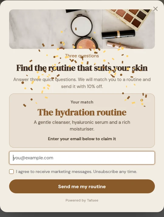
- Quiz entry: 'Find your perfect fragrance in 30 seconds' that asks for an email to send the result.
- Waitlist: for an upcoming launch or collection, with an expected date.
Popups that recover sales
- Exit intent on the cart: a reminder of what is in the cart plus a reassurance about returns or delivery.
- Free-shipping progress bar: a slim bar showing how far the shopper is from free delivery.
- Save my cart: send the cart to email or WhatsApp for later.
- Back-in-stock alert: on sold-out product pages, capture interest instead of losing it.
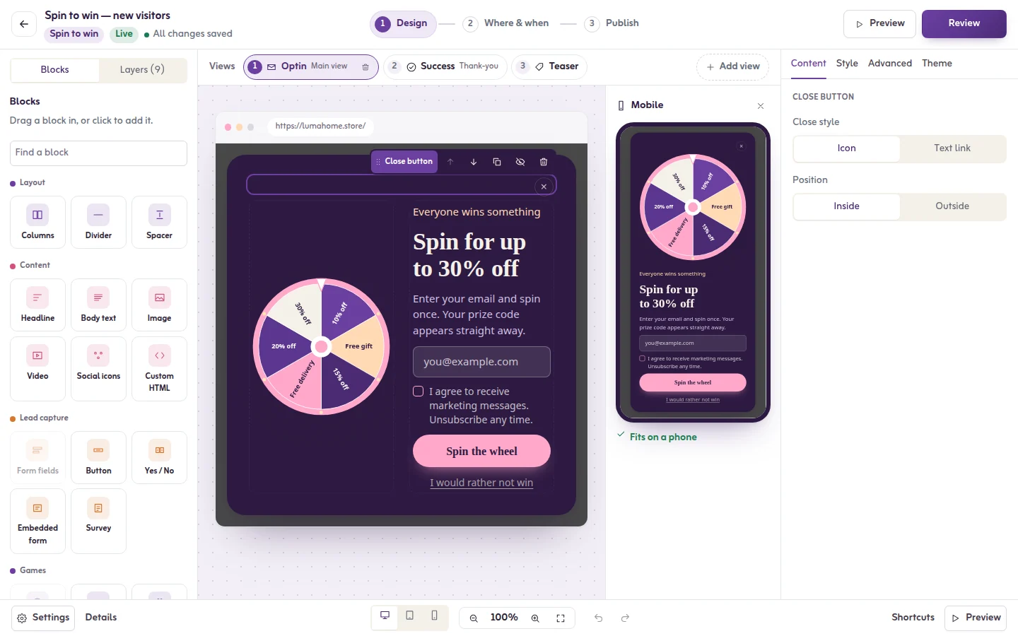
- Spin to win: a gamified wheel with a mix of rewards, best used sparingly for new visitors.
- Bundle suggestion: a slide-in on the product page suggesting a complementary item.
Popups that announce and inform
- Announcement bar: delivery cut-off times, new branches, or holiday opening hours.
- Sale countdown: a real deadline with a countdown timer at the top of the page.
- Shipping or COD notice: coverage by city and cash-on-delivery availability, shown once.
- Language prompt: invite visitors to switch to Arabic or English based on the page they landed on.
- Cookie and consent notice: clear, short and compliant, not a wall of text.
Popups that collect feedback and leads
- One-question survey: 'What almost stopped you from buying today?' on the order confirmation page.
- Demo or consultation booking: on pricing pages for B2B and services.
- Callback request: name and phone number for high-consideration purchases such as furniture or real estate.
- Content locker: unlock a premium guide after signing up, used only for genuinely valuable content.
Seasonal popup ideas for the Gulf
- Ramadan: gift guides, iftar-time delivery slots and early access to Ramadan offers.
- Eid: last-order dates for Eid delivery and gift-card reminders.
- White Friday and UAE National Day: early-access signups before the sale and countdowns during it.
Popup design tips
- One goal per popup. One headline, one short sentence, one button.
- Lead with the benefit, not with 'Subscribe'. 'Get 10% off your first order' says what the visitor gets.
- Make closing obvious. A visible close button and closing on Escape or on a click outside.
- Match your brand colours and fonts so it feels part of the site, and check text contrast.
- Design Arabic properly. Right-to-left layout, Arabic fonts and copy written in Arabic, not mirrored English.
- Use smaller formats on mobile: slide-ins and bars instead of full-screen overlays on arrival.
- Keep forms short: email or phone first, extra questions later.
Timing and frequency
Show popups after a meaningful action, such as scrolling, time on page or exit intent, rather than on arrival. Cap how often the same person sees a popup, and do not show signup offers to people who already subscribed or bought.
Do popups hurt SEO? Google's mobile guidance
Google has said that intrusive interstitials on mobile can make content less accessible and may affect how pages are ranked. Its examples of intrusive patterns include a popup that covers the main content immediately after a visitor arrives from search, or a standalone interstitial the visitor must dismiss before reaching the content. Its examples of acceptable patterns include legally required notices such as cookie consent or age verification, and banners that use a reasonable amount of screen space and are easy to dismiss.
In practice: on mobile, avoid full-screen popups on landing, prefer bars and slide-ins, and trigger larger popups after engagement or on exit intent.
Don'ts
- Do not use guilt-trip close links ('No thanks, I hate saving money').
- Do not fake urgency with timers that reset.
- Do not stack several popups on one page view.
- Do not hide the close button or make it tiny on mobile.
Build these with Tafsee Popup
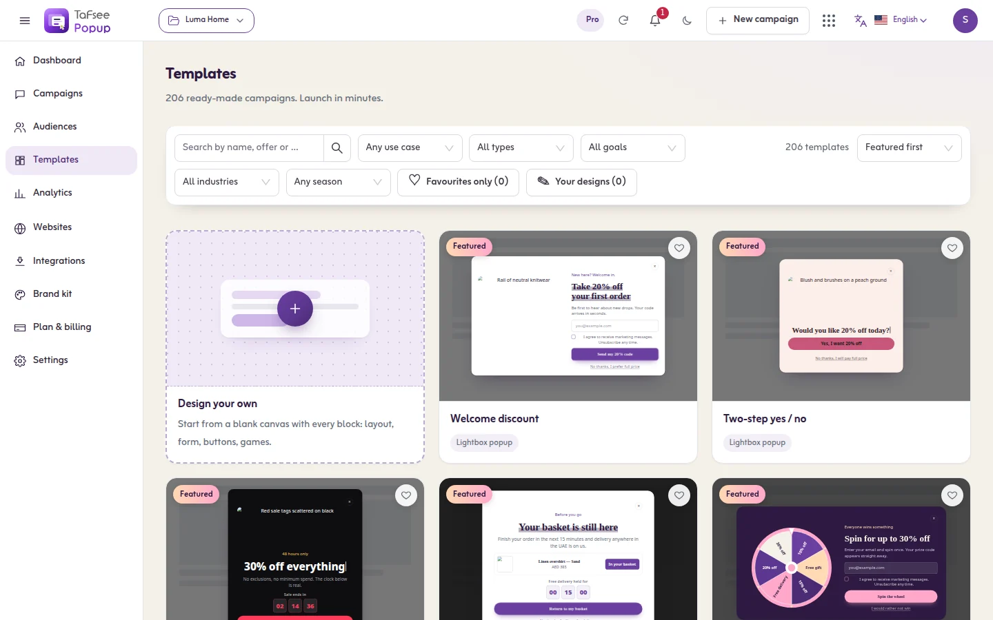
Tafsee Popup includes 209 templates, including Arabic/RTL templates and seasonal designs for Ramadan, Eid, White Friday, Black Friday and UAE National Day. Layouts include modal, slide-in, floating bar, fullscreen, welcome mat, inline, sidebar, content locker, spin-to-win and countdown, with 39 trigger and targeting rules and frequency caps. Browse all solutions, or try the free countdown timer generator.
Frequently asked questions
Popups that cover the main content on mobile as soon as a visitor arrives from search can be treated as intrusive interstitials. Bars, slide-ins, legally required notices and popups shown after engagement are generally fine.
After the visitor has engaged, for example scrolled a portion of the page, spent some time on it, or shown exit intent. Test timing with A/B tests rather than guessing.
As many as you need for different pages and goals, but no more than one should appear per page view, with frequency caps so the same visitor is not shown it repeatedly.